whitecapsrebrand, wayfinding, animation
The rebrand of the West Michigan Whitecaps, the minor league baseball team located in Grand Rapids was created with the goal of developing understanding of branding and brand evolution.
The project was split into two parts. Part A focused on discovery and research of a brand and moved into the development of a design brief, setting an outline and initial visual direction. Part B then focused on visual execution and implementation of the brand in context.
logo


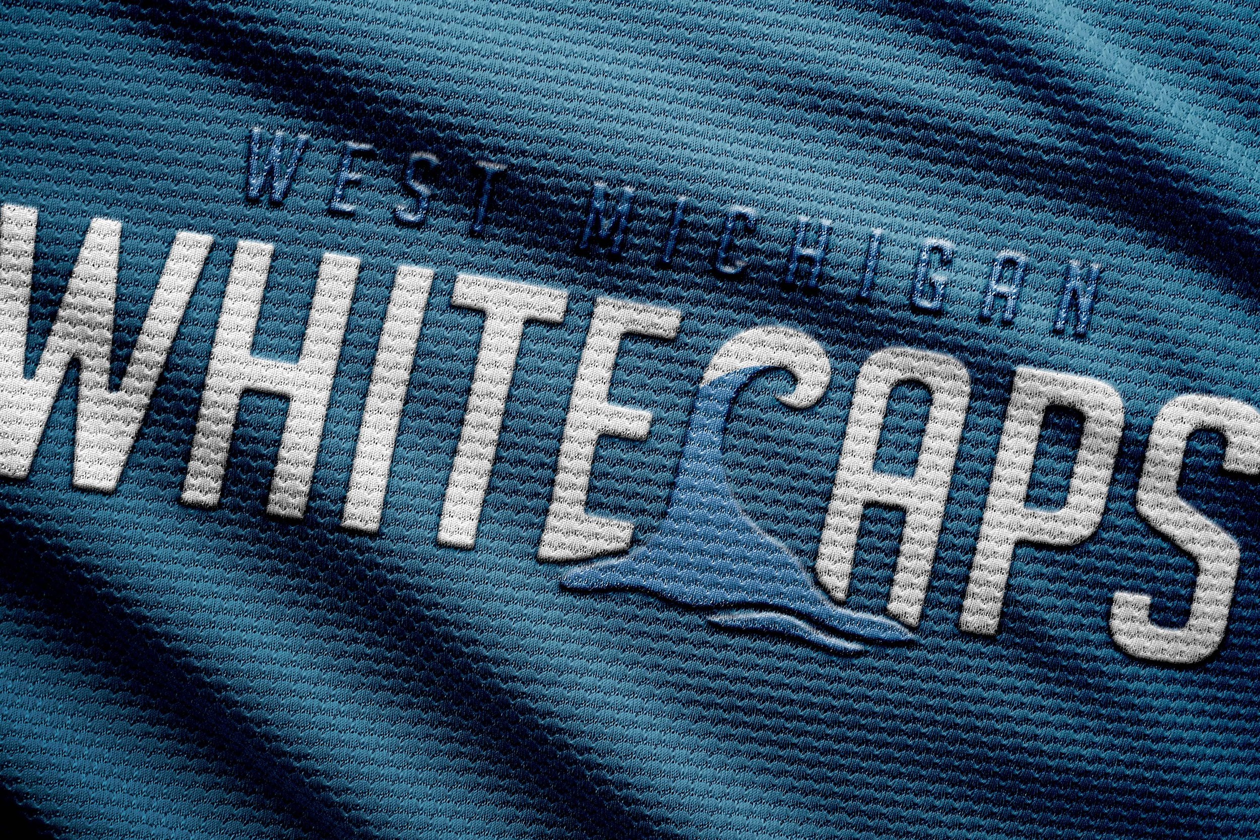
This new logo took the old one and striped it down to it’s most simplistic forms. Keeping the same hierarchy, energetic letter forms, and an illustrated wave maintains the brands ethos while simplifying it to make it more versatile and accessible.
Being revolved around an exciting sport, it was important to illustrate how the brand exists in the digital and motion world.
This animation would be played on the Jumbotron at LMCU Ballpark, welcoming the crowd as they wait for the first pitch.
brand assets


This branding system as a whole is very versatile; therefore, can be used in many different mediums in many different ways. As one can see, the preservation of the athletic, fun feel was integral, but having the simplistic spin of it makes it easier for people to digest and interact with across multiple platforms.


brand applications


class: branding and service design duration: 7 weeks
